Slipknot's New 'S' Logo Sparks Outrage Among Fans
Fans take to Instagram to criticize the updated logo, likening it to a disfigured paperclip.
Summary
- Slipknot’s latest merch drop features a controversial new “S” logo, sparking backlash from fans.
- The updated design has been compared to a disfigured paperclip, with comments flooding Instagram demanding it be scrapped.
- Despite the uproar, the classic Slipknot logo remains on most of the merchandise, easing fears of a full rebrand.
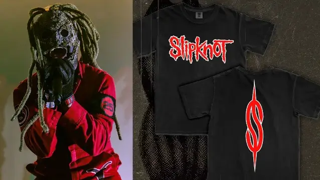
Slipknot has rolled out a batch of limited edition merchandise, and one particular shirt seems to have set off quite the tempest. On the front? The band’s name—classic enough. But the back features a newly-mangled “S” logo that looks less like a menacing symbol of a metal empire and more like a disfigured paperclip. Naturally, fans are not amused, and they’ve taken to the band’s Instagram to let loose with some choice words. A sampling of the outrage:
- “Clown needs to delete Photoshop from his computer immediately.”
- “This S looks like it escaped from an office supply drawer.”
- “Please, I’m begging you, don’t let this be the new logo.”
- “Slipknot, we love you, but this S design is not it.”
- “Who thought this logo was a good idea? Absolutely no one.”
- “The classic S was perfect—don’t ruin it with this nonsense.”
- “This paperclip cosplay isn’t worthy of the Slipknot name.”
- “If this is what the merch team has in store, just stick with black T-shirts.”
- “This logo gives off serious ‘graphic design is my passion’ vibes.”
- “Please fire whoever greenlit this and bring back the real S.”
Related
You get the picture. Fans hate it. And honestly? I can’t say I’m all that fond of it either. It’s like the logo lost a fight with a shredder. But let’s not pretend this is the apocalypse. The classic Slipknot “S” logo is still plastered all over the rest of the merch. This isn’t some grand rebranding scheme. Not yet, anyway.
If you’re curious about the shirt that sparked the drama, it’s available here. One little wrinkle to add to the speculation: the Slipknot website’s loading screen now features this controversial “S” design. Maybe it’s just a quirky placeholder, or maybe they’re testing the waters for a broader change. Either way, the backlash is loud, and I doubt they’ll be rushing to paperclip-ify their legacy anytime soon.
Got a tip for us? Email: [email protected]
After a decade of delays, Jim hints at leaking the long-awaited album on YouTube himself.


